CGI Behind the scenes:
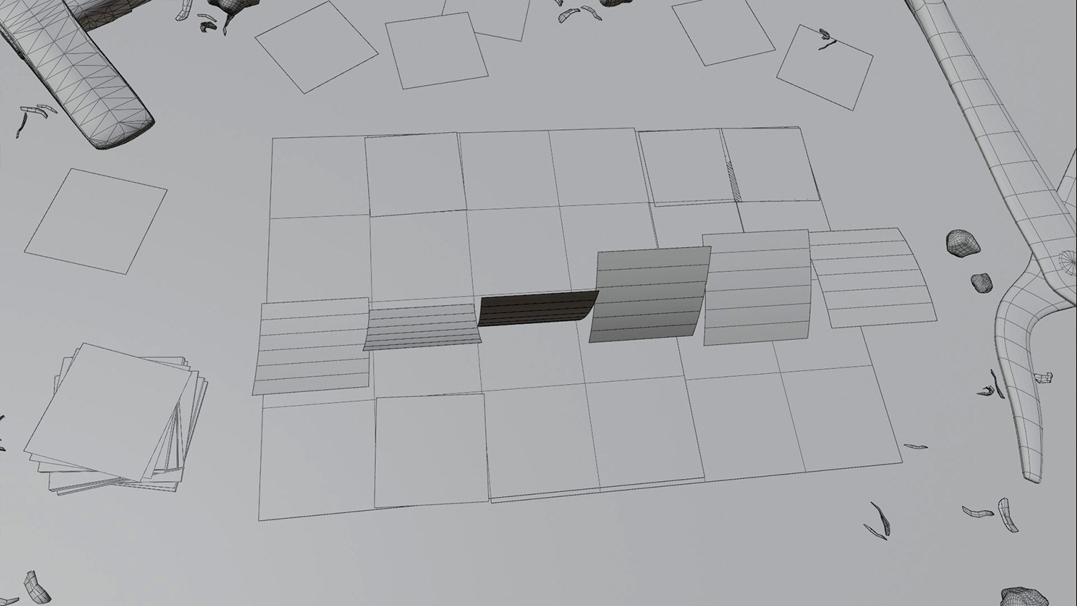
Behind the scenes
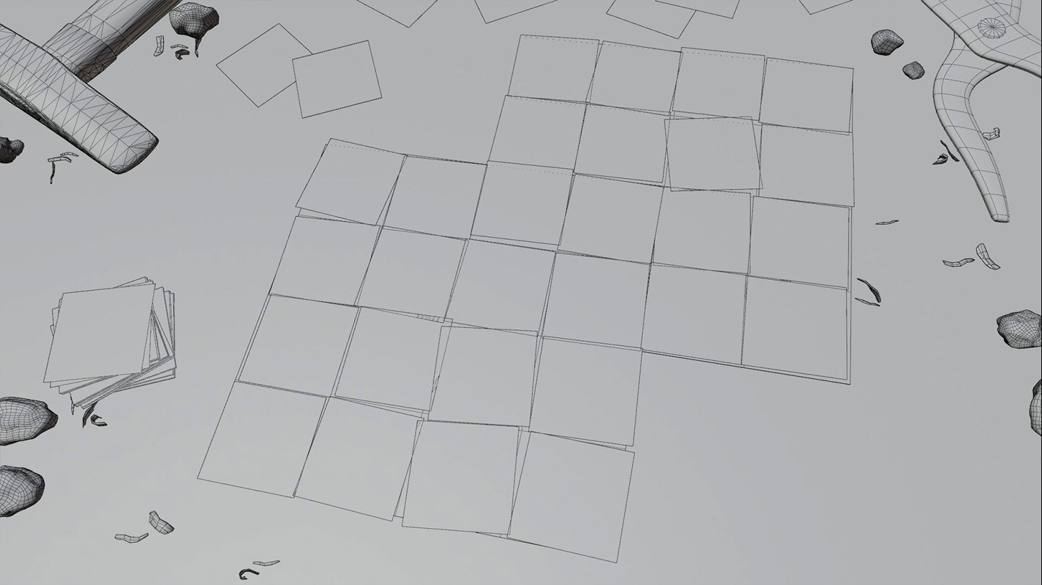
Behind the scenes
Accessibility Focused Design
Since Alchemist is played in real-time and relies on moment-to-moment decision making, accessibility has been a primary focus. The resulting clear and readable design choices ends up aiding all audiences, not just those who need it most.
Different icons were play-tested to find eight designs that were easily distinguishable from each other at a glance. These icons also needed to have x-axis symmetry so that cards could be held and played upside down.
The need to consider colorblindness and playing under low-light conditions means utilizing multiple differentiators to deliver the same information. It also demands special attention to tone and contrast to help differentiate each card type.
Production Art
A mix of original illustration and graphic design was used to create the components.

English / Latin

German / Dutch
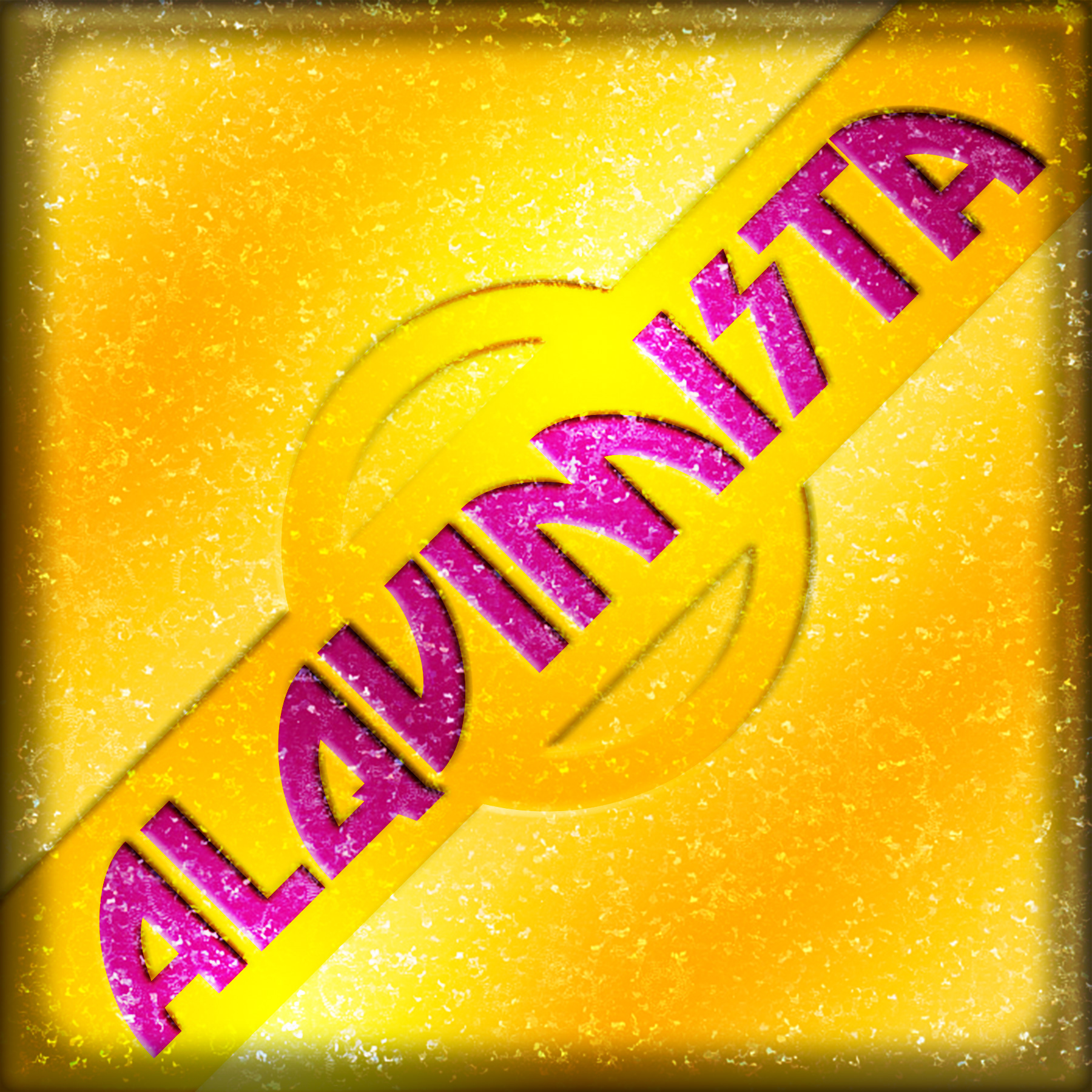
Spanish / Portugeuse
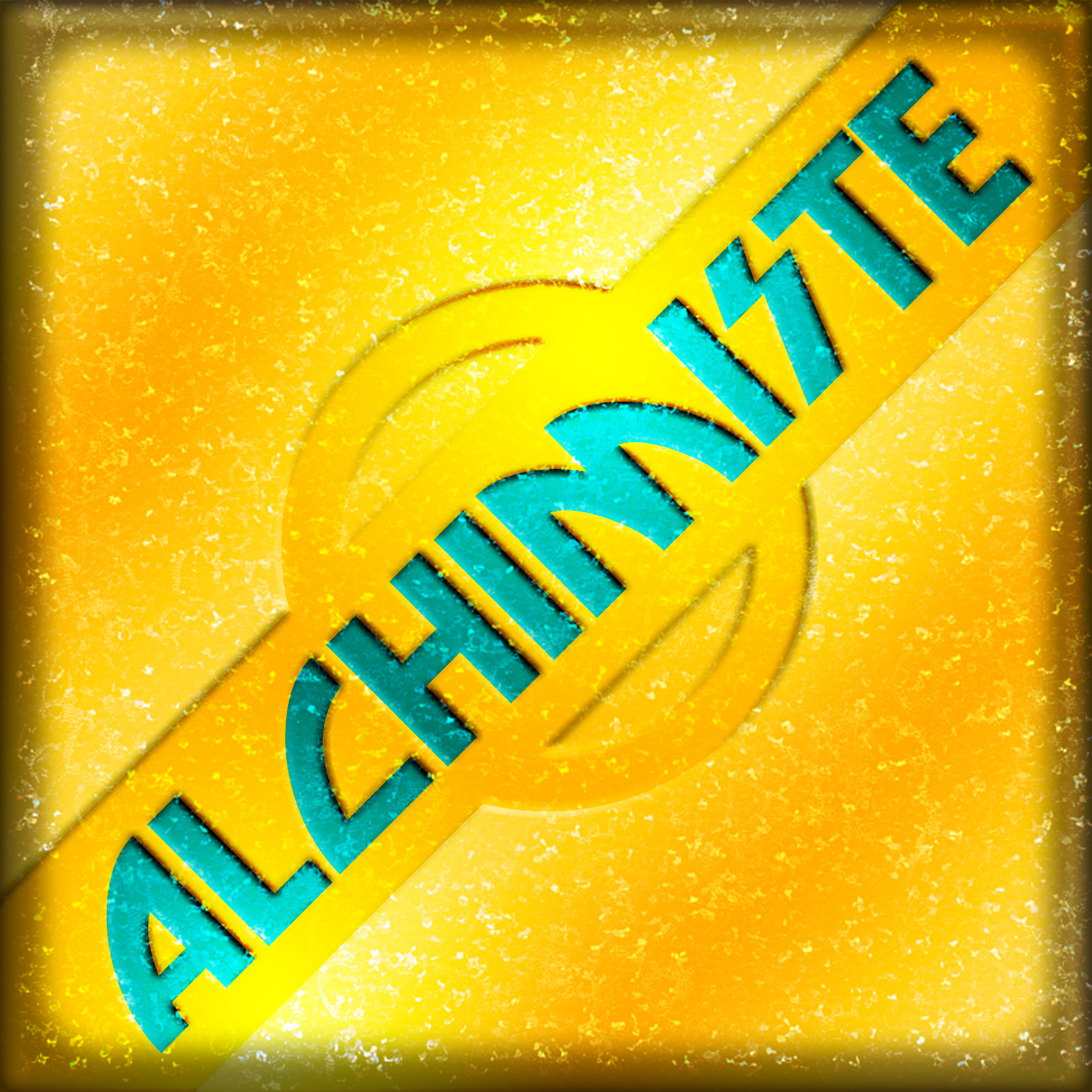
French
Shown above are the game's card backs. Each player's deck is differentiated not just by color but by displaying the game's logo in a different language (English, German/Dutch, Spanish/Portuguese, and French). This greatly reduces the need for language localization.
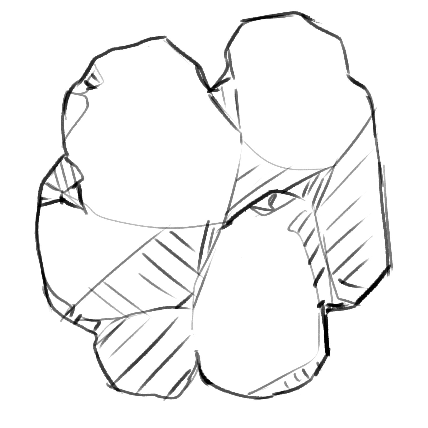
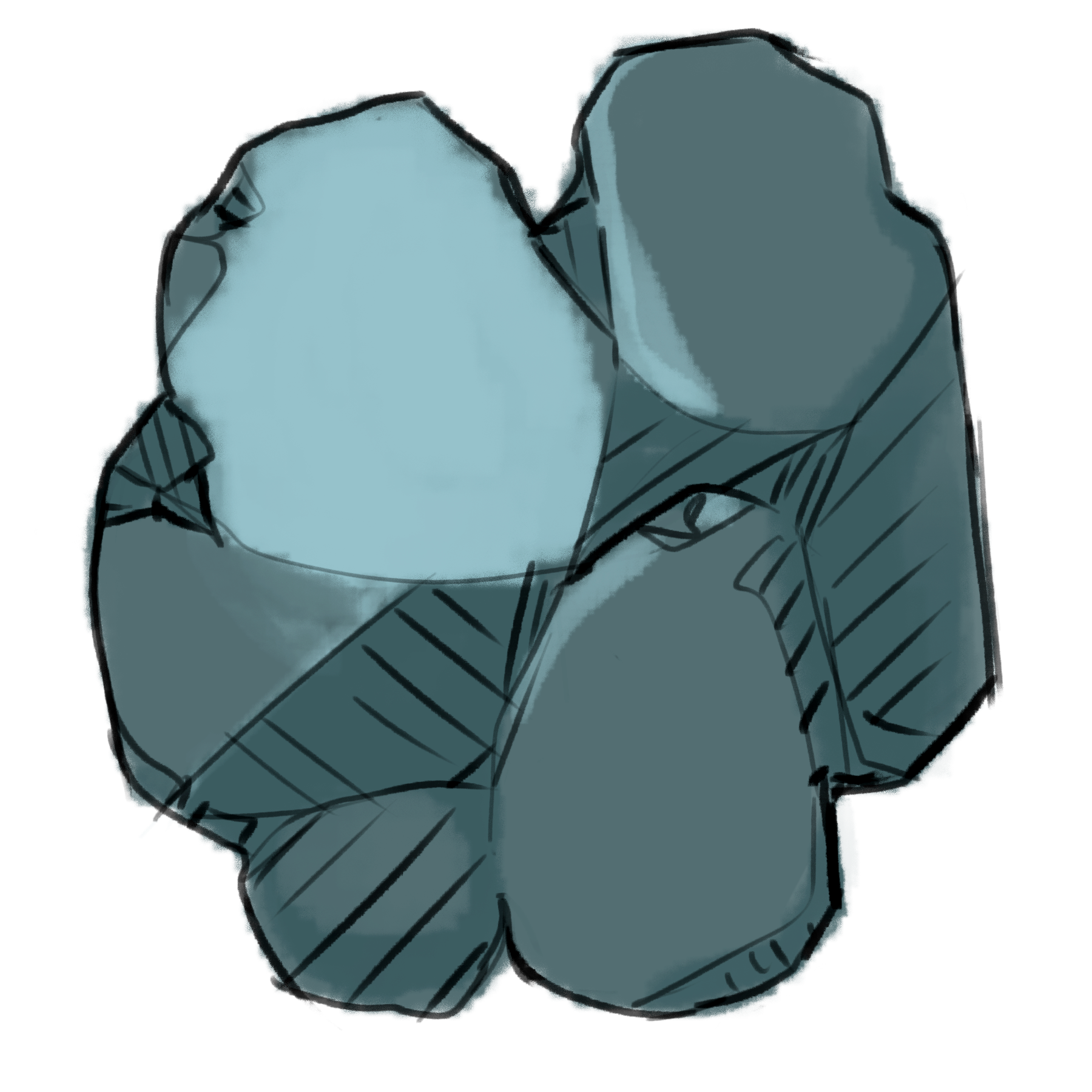

This is a selection of various game component designs, including an art breakdown from illustration to color to the adding of graphic elements.
